Universal Windows Platform (UWP) apps adapting to multiple devices
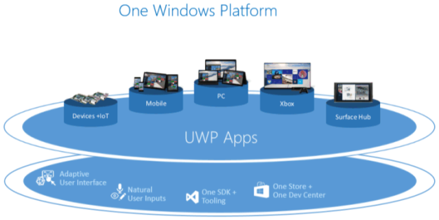
With UWP apps it has become easier then ever to write a single app that will run natively on all Windows 10 devices be it a phone, tablet, PC, Xbox et. al. Now we don’t just want our apps to be able to run on a device we want them to shine while they are running. In this blog post we will look at the basics on how to adopt to different screen sizes within your UWP app.
The devices and screen sizes
UWP runs on many different platforms some might not even come with a screen by default e.g. Internet of Things (IoT) devices or others that require a unique UI such as HoloLens which should be available for a few lucky developers later this year. Now while those platforms are very interesting in certain scenarios a wide array of apps will most probably be developed for mobile devices such as phones, tablets and phablets aka BAPHs (Big a** Phones). The unique thing about the UWPs in comparison to Android and iOS apps is that you apps will not only run on mobile devices but on desktop machines, laptops and even larger screens such as the new Surface Hub.

Now write once run everywhere and look like crap is easy to do. But the great benefit of creating a UWP app is that you can adopt to the different screen sizes and even adopt to different user input such as touch vs mouse and keyboard. But before we dive into the details of how we can write responsive UIs with XAML lets have a look at some basic layout rules.
Devices and screen sizes
A general split up of the devices can be made as follows.
| Category | Screen size | Width in Effective Pixels | Inputs |
|---|---|---|---|
| Phone | 4” to 6” | 340+ | Touch & Voice |
| Phablet | 6+” to 7” | 720+ | Touch & Voice |
| Tablet | 7” to 13.3” | 1024+ | Toch, Stylus, External keyboard*, Mouse*, Voice* |
| PCs and Laptops | 13” and greater | 1024+ | Mouse, Keyboard, Touch*, Gamepads |
| Surface Hub Devices | 55” and 84” | 1024+ | Touch, Pen, Voice, Keyboard, remote Touchpad |
*: occasionally
Basic layout guides
Since UWP apps are built from the ground up to run on all kinds of different devices i.e. form factors the platform comes with many helpers that make life easier to design for multiple platforms. One basic concept are effective pixels. Effective pixels differ from actual physical pixels so 24 effective pixels on a phone will scale up to a larger physical appearance on a larger screen. The scaling of effective to physical pixels is all done by the framework and does not require any special attendance by the developer i.e. designer.
Note: Often small screens do have very large Dots Per Inch (DPI), this is also handled by the platform so even if you are running on a small device with a cheap display i.e. low DPI the text will still be readable as clearly as on a higher end display with more pixels i.e. a higher DPI.
The scaling is based on multiple of fours (4), so when defining layouts make sure they are a multiple of four e.g. 16. This will ensure that the scaling will not lead to strange effects. When using icons, rather than using images try to use a font (for example the new Segoe MDL2 Assets) that provides the icon you are looking for (or close enough). Though Windows 10 does provide a mechanism that chooses between different resolutions of an image according to the screen size, a font will always scale without any further effort.
Implementing responsive layouts that adapt to the available screen space
When working with different resolutions there are multiple layout adjustments that can be performed to improve general User Experience (UX) and – Interaction. UWP offer a variety of ways to adjust the layout of an app according to the available screen space.
- Changing layout of elements on a page according to form factor and available screen space
- Reflow e.g. adding text columns when the screen size increases
- Reveal information/functionality depending on the device and it’s resolution
- Replace elements such as navigation bars with fly out menus to accommodate smaller screen estate
- Change screen flow e.g. of master detail sites
So lets dive into how we can change the layout of UI elements according to the screen space.
Responsive Layout
One new feature of UWP apps is the possibility to adapt the layout of the controls according the available screen size i.e. the effective pixels width of the app windows. This lets the UI adapt to different screen sizes e.g. phones and tablets but also lets the UI adapt to the size a Window has on a desktop.
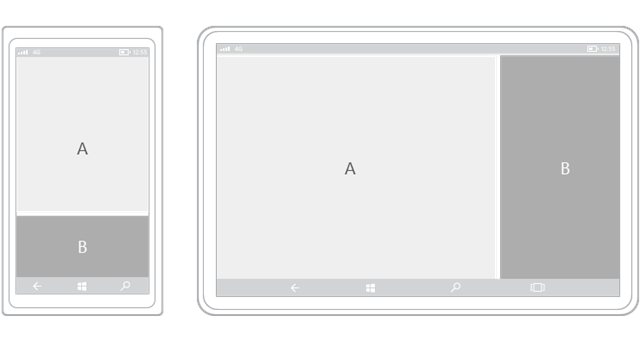
Lets assume you have the following screen flow and layout in your app:
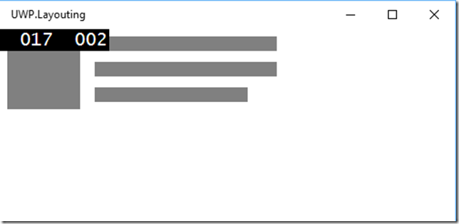
The basic Layout of the app looks as follows:
<RelativePanel>
    <Rectangle x:Name="Image" Width="80" Height="80" Fill="Gray" Margin="8"></Rectangle>
    <Rectangle x:Name="TextLine1" Height="16" Width="200" Fill="Gray" RelativePanel.RightOf="Image" RelativePanel.Below="" Margin="8,8,8,4"/>
    <Rectangle x:Name="TextLine2" Height="16" Width="200" Fill="Gray" RelativePanel.RightOf="Image" RelativePanel.Below="TextLine1" RelativePanel.AlignLeftWith="TextLine1" Margin="8,8,8,4"/>
    <Rectangle x:Name="TextLine3" Height="16" Width="168" Fill="Gray" RelativePanel.RightOf="Image" RelativePanel.Below="TextLine2" RelativePanel.AlignLeftWith="TextLine1" Margin="8,8,32,4"></Rectangle>
</RelativePanel>
Note: that rendering the items in a RelativePanel allows the elements within i.e. the Rectangle to align themselves relative to one another. This is a new layout feature available in Windows 10 UWP apps which previously had to be done with a Grid or StackPanel. The benefit of using relative layouts is when we focus on how we might want to realign the content for a different screen(size).
For instance when displayed on a tablet you might not just want to show a small image next to the text but go with a banner. Using a VisualStateManager one can easily define trigger points for the minimal window Width and if the trigger fires adopt the layout of the predefined layout:
<VisualStateManager.VisualStateGroups>
    <VisualStateGroup>
        <VisualState x:Name="wideView">
            <VisualState.StateTriggers>
                <AdaptiveTrigger MinWindowWidth="720" />
            </VisualState.StateTriggers>
            <VisualState.Setters>
                <Setter Target="Image.(Width)" Value="720"/>
                <Setter Target="TextLine1.(Width)" Value="720"/>
                <Setter Target="TextLine2.(Width)" Value="720"/>
                <Setter Target="TextLine3.(Width)" Value="600"/>
                <Setter Target="TextLine1.(RelativePanel.Below)" Value="Image"/>
                <Setter Target="TextLine1.(RelativePanel.AlignLeftWith)" Value="Image"/>
            </VisualState.Setters>
        </VisualState>
        <VisualState x:Name="narrowView">
            <VisualState.Setters>
                <!-- Adjust view for narrow view -->
            </VisualState.Setters>
            <VisualState.StateTriggers>
                <AdaptiveTrigger MinWindowWidth="0" />
            </VisualState.StateTriggers>
        </VisualState>
    </VisualStateGroup>
</VisualStateManager.VisualStateGroups>
The name of the Target matches the x:Name given to the controls. The page will now re-render if the app has more then 720 effective pixels:
The page will also adjust when resizing the window on a Windows 10 desktop machine which allows the user to have multiple applications open at once with them seamlessly adapting to new windows sizes.
Conclusion
In this post we saw that Universal Windows Platform Apps not only run on multiple devices but that the platform provides the developers and designers with the necessary tooling of creating a great User Experience no matter the screen size and resolution without having to create multiple page layouts from the ground up and having to somehow figure out the size of the screen itself.
You can find the entire project on GitHub.


