Creating a countdown button for .NET MAUI
Maybe it is old age or just a lack of attention, but I have felt a lot less flexible over the past, so I did what every app developer would do. Go to the app store and search for an app that could help. Not only did I find an app that has dramatically improved my flexibility due to a stretching routine focused on my weak points, but it also had a neat countdown button control. And since it is UI July, this is a post for the said community event. Let’s have a look at how we can create such a control.
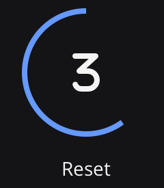
Perhaps you might be wondering: What is this countdown button control you are talking about? - Well, thank you for asking. The control starts at 100%. While the seconds are counting down, the circle around the control reduces itself as time passes.

As you might have already thought. This is the time you are doing a stretch. So how can we implement such a control in .NET MAUI.
The round button
Let’s start with the easy bits, a round button control:
<Button x:Name="ProgressButton"
        Text=""
        FontSize="18"
        FontFamily="fa-regular"
        HeightRequest="80"
        WidthRequest="80"
        CornerRadius="40"
        HorizontalOptions="Center"
        Clicked="StartButton_OnClicked"
        BackgroundColor="{StaticResource Secondary}"/>
A general rule of thumb a button is a rectangular UI element. We get a square if we set the HeightRequest and the WidthRequest to the same value. Further configuring the CornerRadius to half of the height/width value, we get a nice circle.

We can set the default text to the play icon. For this, I added the Font Awesome font to the project. And if you have done this in the past with Xamarin, trust me, it is much quicker now, and a friendly docs page will lead you through the steps.
Back to the button. The countdown starts when we tap the button, and the button text shows the remaining seconds:
private void StartButton_OnClicked(object sender, EventArgs e)
{
    _startTime = DateTime.Now;
    _cancellationTokenSource = new CancellationTokenSource();
    UpdateArc();
}

private async void UpdateArc()
{
    while (!_cancellationTokenSource.IsCancellationRequested)
    {
        var elapsedTime = (DateTime.Now - _startTime);
        int secondsRemaining = (int) (_duration - elapsedTime.TotalMilliseconds)/1000;

        ProgressButton.Text = $"{secondsRemaining}";

        // More stuff to come ...

	      await Task.Delay(500);
    }

    // Reset the view
}
The reducing circle
To draw shapes, the .NET MAUI Graphics is always an exciting space to have a skim. And we are lucky there is the functionality present to draw a partial ellipse, i.e. a circle if we set the HeightRequest and the WidthRequest with the same value. As the docs state, we can define the end angle, and the direction the drawing should happen, aka clock- or counter-clockwise.
To get a static sample of this progress ring, we add a new class that implements IDrawable.
public class ProgressArc : IDrawable
{
    public double Progress { get; set; }
    public void Draw(ICanvas canvas, RectF dirtyRect)
    {
        var endAngle = 180; // static angle for the show
        // Drawing code goes here
        canvas.StrokeColor = Color.FromRgba("6599ff");
        canvas.StrokeSize = 10;

        canvas.DrawArc(5, 5, (dirtyRect.Width - 10), (dirtyRect.Height - 10), 90, endAngle, false, false);
    }
}
The default starting point of the arc is at 3 o’clock on a watch face. We, therefore, set 90 degrees as an offset so it will be at noon on the watch face. With this, we have the basic layout of the circle, which can reduce itself. Now we have to hook it up to our UI to see it.
Presenting anIDrawables is done by adding it to a GraphicsView. Let’s add a GraphicsView to our XAML file:
<GraphicsView x:Name="ProgressView"
							BackgroundColor="{StaticResource Primary}"
							HeightRequest="100"
							WidthRequest="100"/>
And since we made it a named element, we can then assign our ProgressArc in the OnAppearing method, which is invoked before the system draws the UI:
public partial class MainPage
{
    private ArcProgress _arcProgress = new ArcProgress();

    // Other members and the constructor

    protected override void OnAppearing()
    {
        // ...
        ProgressView.Drawable = new ArcProgress();
    }
}
This gives us the basics for presenting a static view of the arc. Now we will have to calculate the end angle. It is time for some maths. 🤓
Given we know the total duration of the countdown, we can calculate the degrees of progress:
circleDegree = elapsedTime / totalTime * 360
If we use this formula and embed it into our existing Draw function, the degrees of our endAngle are calculated as follows:
var endAngle = 90 - (int)Math.Round(Progress * 360, MidpointRounding.AwayFromZero);
Note the 90° offset that has to be included due to the offset we defined when drawing the arc. All left is to update the progress and invalidate the canvas in the existing UpdateArc function.
private async void UpdateArc()
{
    while (!_cancellationTokenSource.IsCancellationRequested)
    {
        // existing code to update the button

        _progress = elapsedTime.TotalMilliseconds;
        _progress %= _duration;

        _progressArc.Progress = _progress / (float)_duration;
        ProgressView.Invalidate();

        await Task.Delay(500);
    }

    // Reset the view
}
Now to the final step, making the round button and the reducing circle align correctly on the UI.
Putting it together
The alignment usually takes some tinkering. Since we want the circle to be just as big as the button or a tad smaller. In the end, I used this XAML:
<Grid>
    <GraphicsView ...
                  HeightRequest="100"
                  WidthRequest="100"/>
    <Button ...
            HeightRequest="80"
            WidthRequest="80"
            CornerRadius="40"
            ... />
</Grid>
Note: By placing the button definition after the canvas, the button will be drawn higher on the Z-Axis. This approach has a few advantages. First and foremost, the circle can still be seen even if the background of the canvas is not transparent. But more important the button can still be tapped by the user since it is on top of the canvas.
And that was it. Here we have our beautiful countdown button control.

Conclusion
And this concludes the countdown button timer. As you can see, drawing round buttons was pretty straightforward. Drawing the circle was a bit more involved, but it also showed that you could create a different shape using .NET MAUI Graphics. Be sure to check out the docs to see the full potential of this library because you will get these goodies all out of the box with .NET MAUI.
You can find a small sample application on GitHub. And don’t forget to look out for existing and other UI July posts all around .NET MAUI eye candy.
HTH
