Creating beautiful Xamarin Forms apps using Atomic Design, F# and Fabulous
Fabulous allows writing Xamarin Forms apps with F# in a functional style. Fabulous has been inspired by Elm, which proved that by using the Model View Update (MVU for short) pattern functional languages are great for writing UI code. While functional code squashes a plethora of potential bugs around null and race conditions - in this post, we will not focus on that aspect of Fabulous. Instead, let us look at how you can create beautiful UIs that stay maintainable in the future.
This blog post is part of the Xamarin UI July organised by Steven Thewissen. Be sure to check out all the beautiful posts by my fellow co-authors.
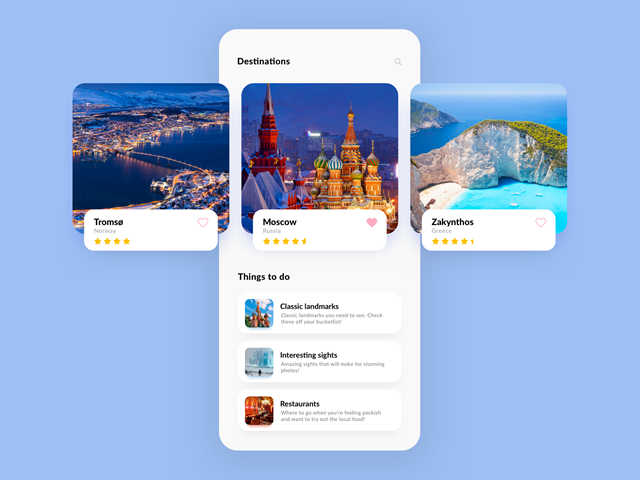
Inspired by some of Stevens previous posts on - what I like to call - lickable UI. I wanted to show why writing UI in code allows you to write UI that is not only beautiful but easy to maintain and extend. So for this post, I will be implementing a design idea I found on Dribbble by Apptaste.
Though this blog post will focus on Fabulous, you could apply the same principle when writing your app using C# and XAML. But you will end up with a bunch of files, and it will feel more complicated. F# a terse language to write to begin with and Fabulous allow for writing apps with fewer lines of code than what you usually require with C# and XAML. I am not saying this is what should be your reason to check out Fabulous. But it is a fact that… If you are new to F# and Fabulous next comes a short intro. If this is all old news to you feel free to skip the intro.
A short intro to Fabulous
Let’s start with the good old Welcome to Xamarin Forms blank app:
module App =
    type Model =
      { Message : string } // your apps state, we could do without...

    type Msg =
        | SomeStateChange // just for the demo, we do not need this...

    let initModel = { Message = "Welcome to Xamarin.Forms!" }

    let init () = initModel, Cmd.none

    let update msg model =
        match msg with
        | SomeStateChange -> model, Cmd.none

    let view (model: Model) dispatch =
        View.ContentPage(
          content = View.StackLayout(
            children = [
                View.Label(text = model.Message, horizontalOptions = LayoutOptions.Center, verticalOptions = LayoutOptions.CenterAndExpand)
            ]))

    // Note, this declaration is needed if you enable LiveUpdate
    let program = Program.mkProgram init update view

type App () as app =
    inherit Application ()

    let runner =
        App.program
#if DEBUG
        |> Program.withConsoleTrace
#endif
        |> XamarinFormsProgram.run app
Yes, this is all the code you would usually have in your blank C# app. We will not go into too much detail on how all the functions work. At the bottom, you can see the type App, which translates to the App.xaml.cs class, i.e. the entry point of any Xamarin Forms app. Our analogue to the MainPage is the module App. The three components of the MVU pattern are present with the Model (an F# record, if your new to F# think of it as a POCO, not quite the same but close enough for now) and the view and update functions.
The update function is where all changes of the view are processed. Displaying only text this function has nothing to do really. Since we will be focusing on the UI later, I will give you a short intro to what the update function does in your average app. Imagine all your UI changes and background task events must go sequentially through this point. All state changes are defined. You can reproduce every state of the app - oh and no race conditions
The view function contains the ContentPage, which includes a StackLayout and a Label. At first, you might not think much about it. But look how terse it is written. For example, the StackLayout children , that is a simple list in F#. So adding another element to the grid would be simply adding a new UI element.
The functions get invoked by Fabulous and do not interact with Xamarin Forms directly. This is important to understand because this means that all of the code you write can be 100% unit tested. All the dependencies to the view are resolved within the Fabulous framework. The view function returns the instructions on how to create the UI, but it does not create it. If you change a value such as the welcome message, the Fabulous Framework checks what parts have changed and updates the view accordingly. The React.JS framework uses the same technique with a shadow DOM (Document Object Model) that is then taken to update the actual UI.
Atomic Design and coded UIs
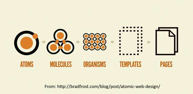
Writing your UI with code comes with a few perks. While you could write all of your UI in the view function. It might get a bit hard to view at a glance over time. But being only code, you can split up the code into different functions. This also allows you to reuse parts of the UI in different places. And reusability reusing/combining components is at the heart of Atomic Design.
While unique design, reusable components sound all great, let’s have a look at how we could design such an app with Fabulous. We want to start with the essential elements (Atoms) which we then put together to more significant UI components and in the end the Page.
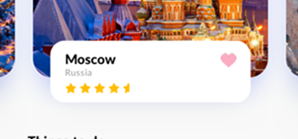
When we look at the design of the app, we can see that most of the title labels seem to have the same font. Another UI component that quickly gets my eye is the cards holding the description of the destination and the things to do:
Now what we can see is that titles have the same font, are bold and apart from the cards in the “Things to do” section have the same font size. So let’s create a function that allows us to create a title label with the parameters text and font size:
let titleLabel text fontSize =
    View.Label(text = text,
        fontSize = fontSize,
        textColor = textColor,
        verticalOptions = LayoutOptions.Center,
        fontAttributes = FontAttributes.Bold)
The destination is shown by a picture (gorgeous pictures if I may say so! ) and a short description of the town, country, rating and a favourite It seems that the favourite should be clickable so let’s assume that is a button. Probably similar to the search button on the top right. Keeping accessibility in mind, I prefer to use buttons or platform interactive controls in general if an interaction is required by the user. This way, it will be easier to optimize the experience using a screen reader. So we want a button with an icon - or a text. Since Xamarin Forms allows us to use custom fonts, we could use a font such as Font Awesome to provide us with scalable icons. Be sure to check out James’ post on how to use Font Awesome with your Xamarin Forms app. So let’s create a function that given the icon, colour, background colour and command function returns us with the button:
let materialFont =
    (match Device.RuntimePlatform with
                             | Device.iOS -> "Material Design Icons"
                             | Device.Android -> "materialdesignicons-webfont.ttf#Material Design Icons"
                             | _ -> null)

let materialButton materialIcon backgroundColor textColor command =
    View.Button(text = materialIcon,
        command = command,
        fontFamily = materialFont,
        fontSize = 20.,
        backgroundColor = backgroundColor,
        widthRequest = 42.,
        textColor = textColor)
So now to the description text i.e. the country. Lets again create a function that will create a label given the text:
let descriptionLabel text =
    View.Label(text = text,
        textColor = secondaryTextColor,
        fontSize = descriptionFontSize
        )
Did you notice the title and description pattern is repeated in the “Things to do” section of the page. Up to now we have created what Atomic Design calls Atoms. Now let’s pack some of those atoms into a coherent block such (Molecule):
let titleAndDescription title titleFontSize description =
    View.StackLayout(margin = 0.,
        children=[
            titleLabel title titleFontSize
            descriptionLabel description |> fun(label) -> label.Margin (Thickness(0.,-8.,0.,0.))]
This will allow us to reuse the Title & Description duo further. Also, note that we had to adjust the margin a bit. You can think of the |> as a pipe forward. Since we have a View type, we can pipe it forward to a lambda function where we change the margin. Calling the margin function will again return a View type. If you are using LINQ, you most probably have joined multiple calls to where select et al. - we are doing the exact same thing here.
Now looking back at the short description of the destination, we can also see a rating of the city with stars. So let’s create a function that given the icon and text colour returns a Label based on font awesome.
let materialIcon materialIcon color =
    View.Label(text = materialIcon,
        textColor = color,
        fontFamily = materialFont,
        fontSize = 18.,
        verticalOptions = LayoutOptions.Center,
        fontAttributes = FontAttributes.Bold)
The rating bar - I assume it is a read-only indicator that shows me an overall rating between zero to five. Given a rating of 4.5, we want four full stars and one covered by half. So let’s take this control apart, let’s say we want one function that only draws the star for a certain percentage:
let ratingStar percentage =
    let star = materialIcon star starColor
    let boxViewWidth = 16. - (16. * percentage)
    View.Grid(
        padding = 0.,
        margin = Thickness(0.,-4.,0.,0.),
        children = [
            star
            View.BoxView(color = backgroundColor,
                widthRequest = boxViewWidth,
                isVisible = (if percentage > 0. then true else false),
                horizontalOptions = LayoutOptions.End)
            ])
The function aka star factory is called by another function that draws N stars given the rating:
let ratingControl (rating:decimal) =
    let fullNumber = Math.Ceiling(rating)
    let fraction = (rating - Math.Truncate(rating))
    View.StackLayout(orientation = StackOrientation.Horizontal,
        children = [
            for i in 1m .. fullNumber -> if i = fullNumber then ratingStar (float fraction) else ratingStar 1.
        ])
Now we have all of our building blocks together for the description, but we still have the image with rounded corners left. A quick look at the ImageView from Xamarin Forms tells us: “No rounded edges.” But when putting the image in a Frame, we can create the rounded edges effect. So let’s create a function that gives us an image with round corners:
let roundedCornerImage imagePath =
    View.Frame(cornerRadius = cornerRadius,
        padding = 0.,
        isClippedToBounds = true,
        hasShadow = true,
        content = View.Image(
            source = imagePath,
            aspect = Aspect.AspectFill)
    )
The parts are all made now let’s assemble them so that we get the Image with rounded corners overlaid by a short description:
let cityDescriptionFrame city dispatch =
    View.StackLayout(
        margin = Thickness(16.,0.,16.,0.),
        children = [
            (roundedCornerImage city.Image |> fun(img) -> img.HeightRequest 320.)
            View.Frame(
                heightRequest = 70.,
                margin = Thickness(24.,-64.,24.,0.),
                padding = Thickness(20.,12.,16.,12.),
                backgroundColor = Color.White,
                cornerRadius = cornerRadius,
                content = View.Grid(
                    rowdefs=["auto"; "auto" ],
                    coldefs=["*";"auto"],
                    children=[
                        (titleAndDescription city.Name titleFontSize city.Country)
                        (favoriteIcon city dispatch).GridColumn(2)
                        (ratingControl city.Rating).GridRow(1).GridColumnSpan(2)
                        ]
                ),
                hasShadow = true)
        ])
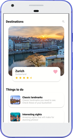
Similarly, we can implement the “Things to do” section. The great thing is we can reuse a lot of components that we have already created. Then we can put all the parts together in the view method which presents us with the following UI:
You can find the entire sample on GitHub.
Side notes: No, we are not required to have all the code in one file. But since this is a one-pager application, I left it together, so it is easier to navigate the code in a browser. Further note that the
CarouselViewdid not work correctly when I was working with the view. I hope I will be soon able to get it working and have a sample which will allow switching between cities as intended by design.
Conclusion
Applying the Atomic Design pattern to your UI can really make your app easier to maintain and create. Given that Fabulous allows writing your UI in code, it is relatively straight forward to create a custom and consistent UI without much boilerplate code. Further Fabulous offers a live update feature which allows you to live code during a debug session. Not only does the UI adapt, but also the logic is executed. You can read more about the live update feature on the official site.
It seems that writing UI with code is coming back into style during the recent days of 2019. With companies like Apple working on Swift UI. If you are a die-hard C# lover, you should check out the Post by Ryan Davis on writing UIs with C# for Xamarin.
You can read more about the Atomic Design pattern on Brad Frosts website.


